Introduction
Design tools don’t fail because they lack features. They fail because teams can’t collaborate, can’t review work fast enough, or can’t ship consistent UI at scale.
If you’re building SaaS, the tool choice shows up in very specific places:
- How fast a PM can review a flow
- How often engineers get “final final” screens
- How painful it is to keep design and code aligned
- Whether a distributed team can actually work together
This article compares Figma vs Sketch vs Adobe XD through that lens. Not “which is best,” but which is least likely to slow your delivery.
Insight: The best UX and UI tool is the one that reduces handoffs. If it adds meetings, it’s a tax.
What we mean by collaboration tools (not just drawing tools)
For SaaS teams, a design tool is also a collaboration surface. It’s where decisions happen.
A useful tool supports:
- Shared components and design systems
- Async feedback with clear context
- Version history you can trust
- Developer handoff that doesn’t require a screen share
If you’re doing end to end software development, this matters even more because design and engineering move in parallel. The tool should make that parallel work boring.
featuresGrid featuresGrid
What to evaluate in any UX and UI tool:Use this when comparing Figma, Sketch, and Adobe XD- Access model: Can non designers review without friction?
- Source of truth: Is there one canonical place for the latest screens?
- Design system support: Libraries, variants, tokens, and permissions
- Handoff quality: Inspect mode, measurements, and interaction notes
- Version safety: History, branching, and rollback
- Performance: How the tool behaves with large files and many components
What usually breaks in SaaS UX and UI delivery
Most teams don’t struggle with “design quality.” They struggle with design throughput and decision latency.
Common failure modes we see when teams scale past MVP:
- Feedback arrives late, then blows up scope
- Multiple variants of the same component appear across screens
- Engineers implement based on screenshots because specs are unclear
- Stakeholders review in meetings because async review is too messy
- Design files become archives, not living sources of truth
This is the same pattern we talk about when moving from startup hustle to startup muscle. Early on, you can brute force alignment. Later, you need systems.
Key Stat (industry): Treat this as a hypothesis to validate in your org: teams that cut review cycles from 5 days to 2 days often ship more consistently because decisions don’t pile up.
What to measure if you want to be honest about the problem:
- Time from design share to decision (median, not average)
- Number of “rework” loops per feature
- Design to dev mismatch issues found in QA
- Percentage of UI built from shared components
Distributed teams make tool gaps obvious
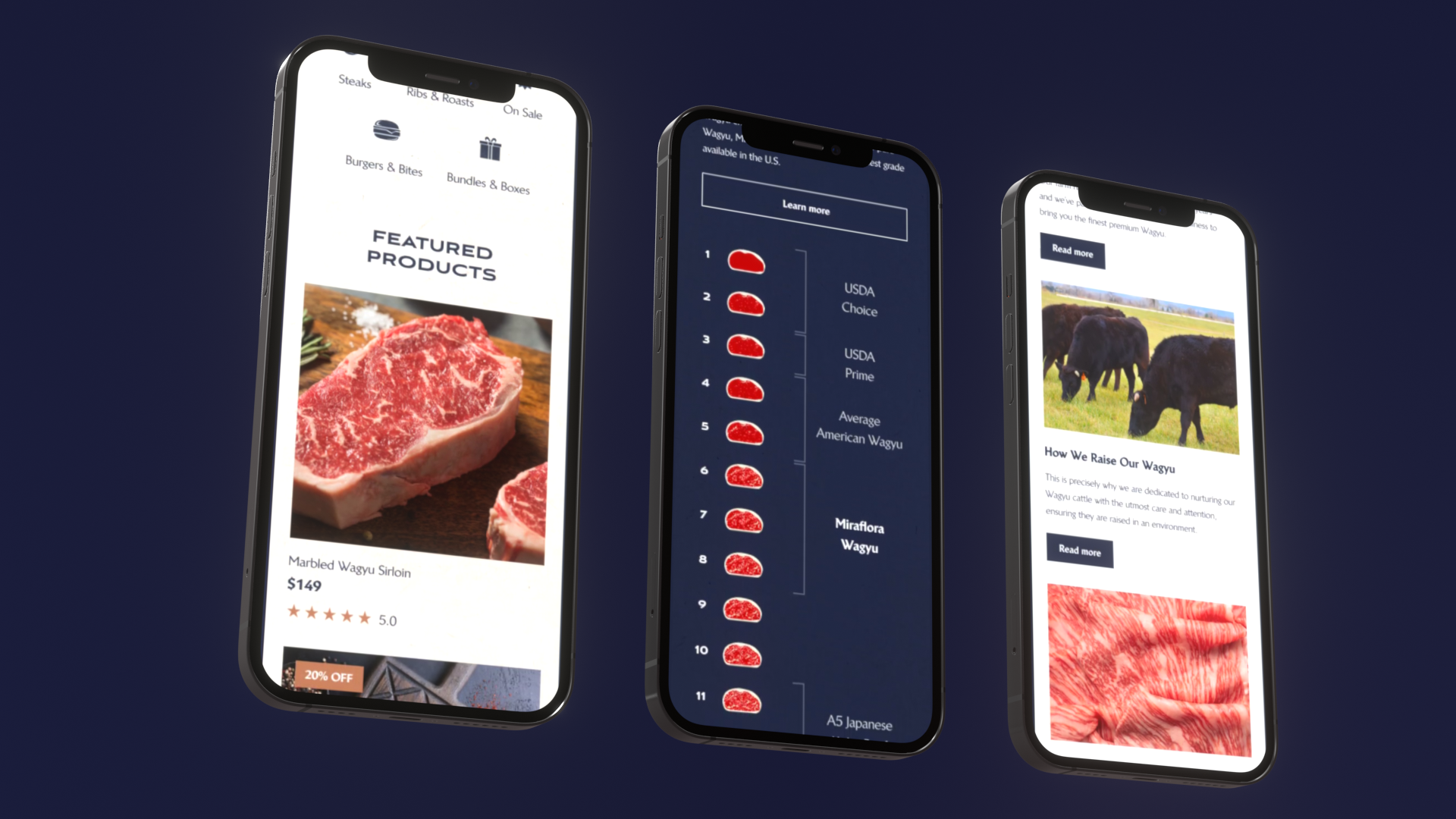
When we delivered Miraflora Wagyu’s Shopify experience in 4 weeks, the hard part was not the UI polish. It was coordination.
The client team spanned multiple time zones. Synchronous feedback was difficult. Early on, we leaned too much on async Slack messages and it created gaps: people reacted to screenshots without context, and decisions got fragmented.
The mitigation was simple and boring:
- One place for annotated feedback
- One place for the latest screens
- One agreed review cadence
Example: In time zone split teams, the tool either enables async clarity or forces meetings. There’s not much middle ground.
_> Delivery context that shapes tool choice
Numbers from our recent work and what they imply for collaboration
Figma vs Sketch vs Adobe XD: the comparison that matters
Here’s the short version: Figma is the default for cross functional SaaS teams because it is browser based and collaboration is native. Sketch is still strong for Mac first design workflows, especially if your org already invested in it. Adobe XD has good interaction design basics, but its momentum has slowed and many teams have moved away.
Make the choice stick
Rollout without theaterA tool switch fails when the team keeps old habits. Keep rollout small and enforceable:
- One file structure standard (pages, naming, archive rules)
- Minimal library (buttons, inputs, spacing, typography)
- Async first review cadence; sync only for conflicts
- Clear handoff rules (what engineers can trust vs what needs a note)
- Track 2 to 3 metrics for 4 weeks, then adjust
Best practices that cut rework: use variants and tokens consistently (or admit you do not have a system), keep prototypes focused on decisions, add interaction notes where UI is ambiguous, treat accessibility as design work. Metric to watch: % of UI built from shared components. Internal hypothesis: under 50% after a few sprints usually means you are paying a custom UI tax in engineering and QA.
A practical comparison table:
| Category | Figma | Sketch | Adobe XD |
|---|---|---|---|
| Collaboration | Strong, multiplayer editing, comments, easy sharing | Improving, but often depends on add ons and file management | Decent, but less common in modern SaaS teams |
| Platform | Browser, desktop apps | macOS only | macOS and Windows |
| Design systems | Strong libraries, variants, team workflows | Strong symbols and libraries, but team scaling can be harder | Works, but ecosystem is smaller |
| Handoff to dev | Inspect mode, links, plugins | Inspect via Sketch tools and plugins | Inspect features exist, fewer teams standardize on it |
| Prototyping | Good enough for most SaaS flows | Good, sometimes needs plugins | Solid for interactive prototypes |
| Hiring and ecosystem | Very strong | Solid, but narrower | Shrinking in many markets |
If your team wants a single recommendation, it’s usually Figma. But there are real reasons to pick something else.
Insight: Tool choice is rarely about features. It’s about who needs access, how often, and with what friction.
Figma: best when collaboration is the bottleneck
Figma fits SaaS teams because it removes access friction. PMs, engineers, and stakeholders can open a link and comment.
Where it tends to work well:
- Distributed teams doing async reviews
- Teams building and maintaining a shared component library
- Projects where engineering needs frequent access to specs
Where it can fail:
- Very large files can get heavy if you don’t manage pages and components
- Teams sometimes treat Figma like a dumping ground and navigation becomes painful
Mitigations that actually help:
- Agree on file structure (pages, naming, archiving)
- Set ownership for the design system library
- Add a “release notes” section in the file for component changes
Sketch: best when you are Mac first and already invested
Sketch is still a strong UI design tool. Many designers love its feel and speed.
It’s a good fit when:
- Your design team is fully on macOS
- You already have a mature Sketch library and workflows
- Collaboration happens through structured review rituals, not ad hoc commenting
Where it can fail in SaaS delivery:
- Cross functional access is harder. Stakeholders and engineers outside the Mac ecosystem feel it.
- File based workflows can create version confusion if you don’t enforce rules.
Mitigations:
- Lock down how files are shared and versioned
- Standardize on a handoff tool and a single source of truth
- Keep prototypes lightweight and focused
Adobe XD: best when you need a simple prototyping lane inside Adobe
Adobe XD can still do the job for UI and prototyping. The challenge is less about capability and more about adoption.
It can make sense if:
- Your org is deep in Adobe workflows and licensing
- You need quick interactive prototypes without much custom tooling
Where it tends to struggle:
- Smaller community and fewer modern SaaS teams using it day to day
- Harder to hire into if your design org grows
If you go with XD, be explicit about why. Otherwise you’ll drift to Figma later and pay the migration cost twice.
processSteps processSteps
Tool selection in 6 steps:A quick process that avoids tool debates- List who reviews designs and how often
- Map time zones and async needs
- Decide what must be standardized (components, tokens, accessibility)
- Run a one week pilot on a real feature
- Score friction points (access, comments, handoff, versioning)
- Commit for a quarter and document the rules
How we choose a tool on real projects (and what we watch for)
In practice, we don’t start with “Figma vs Sketch vs Adobe XD.” We start with constraints.
Tool choice matrix
Friction, not featuresDefault pick: Figma when you need low friction access for PMs, engineers, QA, and stakeholders (browser sharing, comments, multiplayer editing). When Sketch still works: Mac only orgs with an existing library and stable rituals. Risk: collaboration often depends on add ons and file management discipline. When XD is viable: small teams already deep in Adobe. Risk: shrinking ecosystem and hiring pool. Mitigation: plan migration cost upfront (file exports, component mapping, dev handoff workflow). Use this question to break ties: Who needs access weekly, and how many steps does it take for them to review and decide?
Here’s the decision checklist we use in product consulting and delivery:
- Who needs to review designs weekly (PM, QA, execs, client stakeholders)?
- Are reviewers in the same time zone?
- Does engineering need inspect access daily?
- Are we building a design system or just a one off UI?
- What is the cost of switching tools mid project?
Then we pick the tool that reduces the biggest risk.
Typical SaaS scenarios:
- If you have distributed stakeholders and async review: Figma wins.
- If you have a Mac only design org with stable rituals: Sketch can be fine.
- If you have an Adobe pipeline and a small team: Adobe XD can work, but plan your hiring and future migration.
Insight: If your process requires weekly screen share reviews, you don’t have a tool problem. You have a workflow problem.
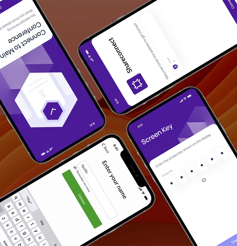
What we learned rebuilding a cross platform mobile app UI
On Mersive, we worked on revamping a screen capturing mobile app across platforms in 2 months. The UI work wasn’t isolated. It was tied to strict platform permissions and edge cases.
In projects like that, the tool needs to support:
- Fast iteration on flows, not just static screens
- Clear state mapping (permissions, errors, system dialogs)
- Handoff that includes interaction notes, not only visuals
A simple habit that helped more than any plugin:
- We kept a single “states and edge cases” page next to the main flows
- Every review included checking those states, not just the happy path
Example: The fastest way to ship a broken UX is to prototype only the happy path.
benefits benefits
What good collaboration looks like in practice:Observable outcomes you can measure- Fewer review meetings because comments are clear
- Fewer “which file is latest” messages
- Higher component reuse rate in engineering
- Less UI rework found during QA
- Faster onboarding for new designers and engineers
Implementation playbook: make the tool choice stick
Picking a tool is easy. Making it stick across a growing SaaS team is the work.
What breaks delivery
Throughput beats tasteMost SaaS teams hit the same wall: decision latency and rework loops, not “bad design.” Watch for:
- Feedback arrives late and expands scope
- Duplicate components spread across screens
- Engineers build from screenshots because specs are unclear
- Reviews happen in meetings because async is painful
What to measure (median, not average): time from design share to decision, rework loops per feature, design to dev mismatches found in QA, and % of UI built from shared components. The “5 days to 2 days review cycle” claim is a hypothesis: validate it by tracking cycle time for 2 to 4 weeks before changing tools.
A lightweight rollout that doesn’t turn into process theater:
- Define a single file structure standard (pages, naming, archive rules)
- Create a minimal design system library (buttons, inputs, spacing, typography)
- Set a review cadence (async first, sync only for conflicts)
- Define handoff rules (what engineers can rely on, what requires a note)
- Track a few metrics for 4 weeks, then adjust
Key best practices that reduce rework:
- Use variants and tokens consistently, or don’t pretend you have a system
- Keep prototypes focused on decisions, not fancy transitions
- Write interaction notes where the UI can’t speak for itself
- Treat accessibility checks as part of design, not QA cleanup
If you want one metric that correlates with sanity, track this:
- Percentage of UI built from shared components
Key Stat (internal hypothesis): If that number is under 50% after a few sprints, you’re probably paying a “custom UI tax” in engineering and QA. Measure it and prove it.
A simple handoff contract engineers will actually follow
Most handoff docs fail because they are too vague or too heavy.
A small contract that works:
- Every screen has a linkable source of truth
- Every component is either from the library or explicitly marked as new
- Every non obvious interaction has a note
- Every API driven state has at least one example (loading, empty, error)
If you want to formalize it, a checklist in your ticket template is enough.
Example checklist you can paste into Jira:
Design handoff - [ ] Link to source file and frame - [ ] Components used are from library (or marked NEW) - [ ] States included: loading / empty / error - [ ] Interaction notes added for non obvious behavior - [ ] Responsive behavior described (breakpoints or rules)This is boring. That’s why it works.
faq faq
Figma vs Sketch vs Adobe XD:The questions teams ask right before they pick a tool- Do we need one tool for everything? Not always. But you want one source of truth for UI.
- Is prototyping the deciding factor? Usually no. Review and handoff friction matters more.
- Can we start in Sketch and move later? You can, but budget time for migration and library rebuild.
- What about plugins and extensions? Treat them as optional. If your workflow depends on a plugin, you’ve added a risk.
- How do we know if the tool is working? Track decision latency, rework loops, and component reuse for a month.
Conclusion
If you’re choosing between Figma vs Sketch vs Adobe XD for SaaS UX and UI design, don’t start with features. Start with collaboration pressure.
A clean takeaway:
- Choose Figma if you need fast, low friction collaboration across roles and time zones
- Choose Sketch if your org is Mac first and already has a stable library and workflow
- Choose Adobe XD if you have a clear Adobe centered reason and you accept the hiring and ecosystem tradeoff
Next steps you can do this week:
- Audit your last 10 design tickets and count rework loops
- Measure median time from design share to decision
- Pick one feature and enforce a strict component reuse rule
- Write a one page handoff contract and test it for two sprints
Insight: Tools don’t create alignment. They either make alignment cheap, or make misalignment expensive.