Tresilio

Mobile app for enhancing mental health with personalized monitoring, sleep tracking, and data-driven insights.
Expertise

UX

Design

Frontend Development

Backend Development

Industry

Health

Timeline

About

Mental health problems don’t develop overnight. Early symptoms can be identified over a longer period of time. For most of us, however, it is very challenging to spot these subtle changes. Psyomics is a biotechnology company founded by Prof Sabine Bahn from The University of Cambridge and Dan Cowell. They wanted to create a tool to explore how people could monitor their psychological well being and develop a better awareness and understanding of their own mental health. Psyomics approached us to help them develop the first stage of the mobile app for a trial phase. Equipped with the psychological know-how provided by the client, we were able to work with Psyomics on the design and interface to deliver Tresilio.

Challenge

Tresilio is a mobile web app meant for different types of users: people who consider themselves healthy, those who may have early signs of mental health challenges, but are unaware and help-seeking individuals.
Users can use the app to monitor their mental health, develop a better understanding of potential causes of any challenges faced or get personalised advice on the best options to access further help and support.

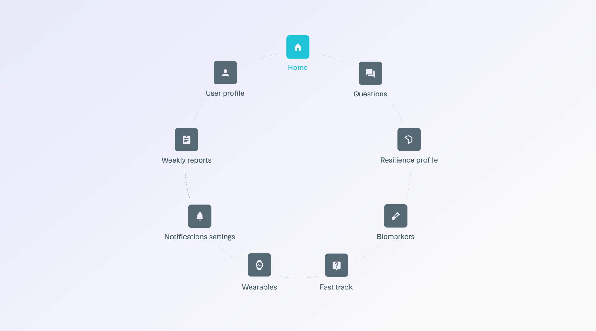
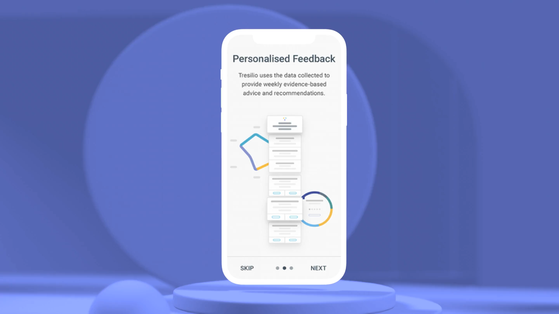
Users start by building an individual profile and work on different user selected topics each week, such as relationships or work based. In addition Fitbit is used to passively track sleep and activity data. Users that don’t use Fitbit are asked questions about their sleep and activity levels instead. At the end of the week, the users receive a detailed report with recommendations.

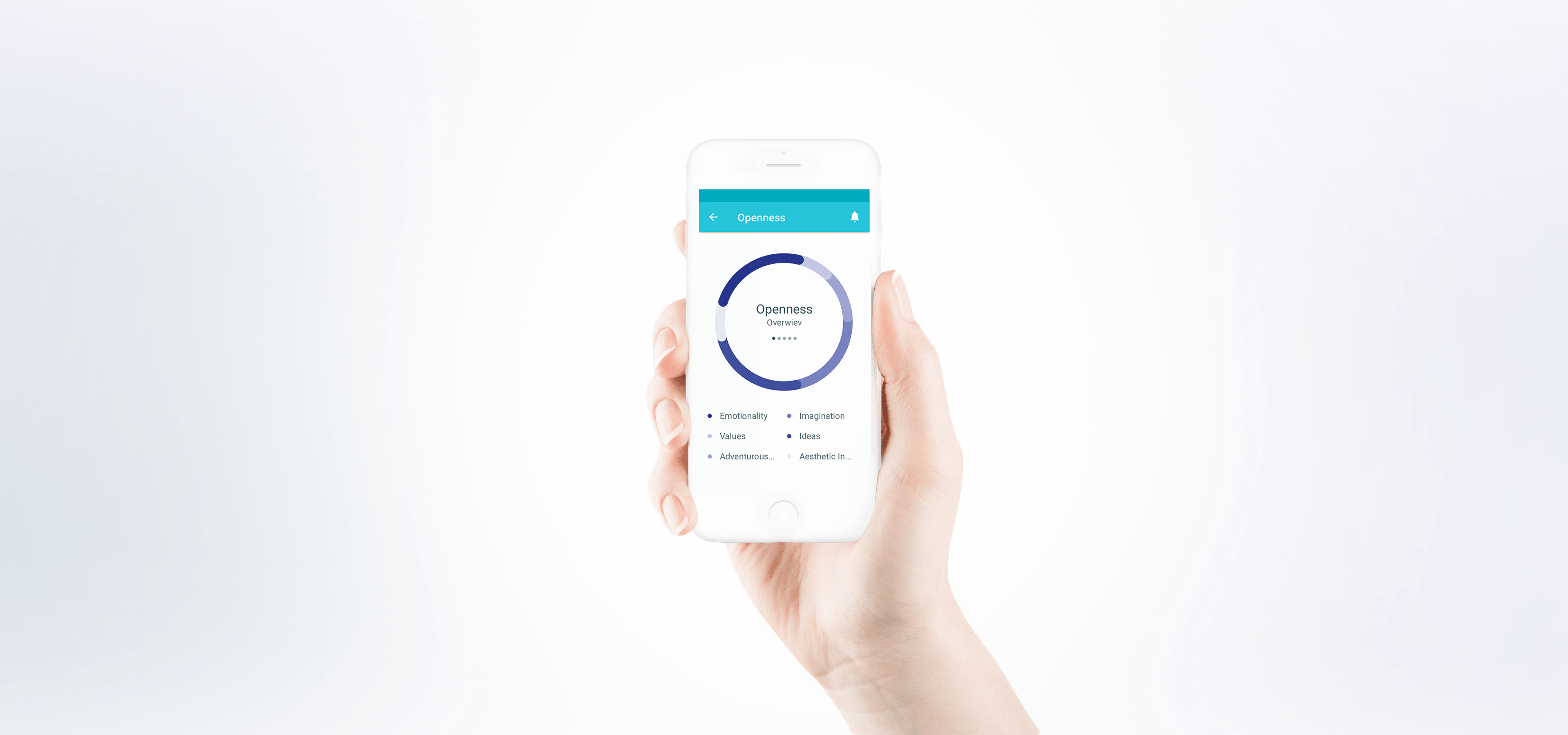
All of the reports are aggregated into a personal profile which includes different aspects of health and wellbeing. This, allows the user to get a holistic overview of their well being.

Process

We believe that a well-run Sprint Zero is an opportunity to uncover risks and dependencies that can otherwise be overlooked. It’s also a great time to sit down with the client and thoroughly analyze the project, tech and business-wise.

This is why we’ve invited Psyomics to come to our Poznań office and take part in a product development workshop. Since the app’s goal and target group had been already defined, we focused on the product itself. We went through the UX and technical requirements. During Sprint Zero we’ve created the general project flow, designed the app’s architecture and chosen the technologies needed to make it happen. On top of that, we’ve generated the API using Apiary.

As a team, we were responsible with Psyomics for designing the interface and developing and testing the app.

Solution

The idea behind Tresilio’s interface design was to make it readable and playful at the same time. The app is based on Google’s material design, so the interface feels easy and familiar. Since Tresilio is an app that relies heavily on surveys, we had to make sure that the questionnaires were engaging and mobile-friendly. As a result, surveys include various vertically-oriented sliders and multiple choice questions, making it easier for the user to provide accurate answers on a narrow screen.

Tresilio’s logo is a variation on a T letter mark, built using only the serifs. The color palette of the app is designed to evoke a feeling of trust and serenity.

Technology

The questions and results seen by the user are determined based on complex algorithms. Given the delicate subject matter, everything had to be executed precisely, so that the reports received by the users were accurate.

Our client provided us with detailed algorithms and mechanics of the app and our job was to turn these dependencies into functioning app logic. The app stores over 1000 questions in total and their order is determined in real time, based on user’s answers. Thanks to code optimization, we were able to shorten the time Tresilio needs to generate another question to just a few milliseconds.

Security and data protection were critical to ensure user confidentiality were protected at all times. This was evaluated and implemented at every stages of the design, build and testing.

We’ve built a Django-based admin panel which enabled our client to load new questions, change their values and manage the biomarkers’ orders. Celery is used to distribute reports and emails (managed with Mailchimp API).

To handle the frontend part of the project we decided to use React, an open-source JS library. The project is divided into small reusable bits, Material-UI helped us to implement the standard Material Design components. It provided us with the flexibility we required: Tresilio, created as web app for the MVP stage, can be turned into a native mobile app faster.

We had to figure out a way to translate complex medical knowledge into insights that can be understood by people browsing the app. We decided to visualize the data using different kinds of interactive graphs. Each graph is built with D3 and rendered using Canvas. This solution improved the performance of the graphs, since SVG animations would be too slow on Android devices.

Questions for the user are presented in an engaging way, with sleek microinteractions. Tresilio is a mobile-first web app, so, in order to maintain good user experience, we had to implement different views for different mobile devices.

Get in touch

Have a project in mind? Send us the details and we will reach out to you with the next steps.

Oops! Something went wrong. Please try again.